New Cards in the Shop!

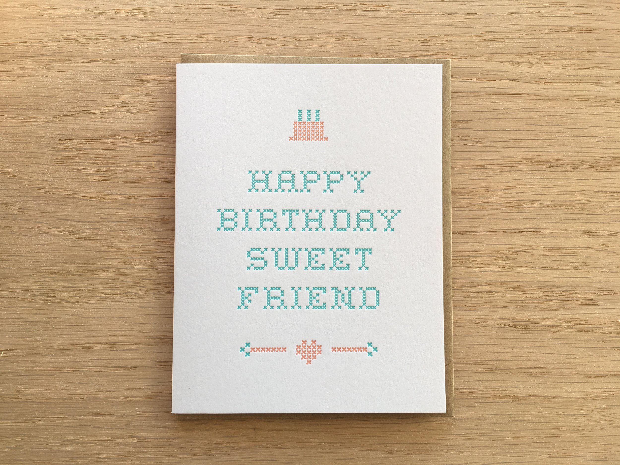
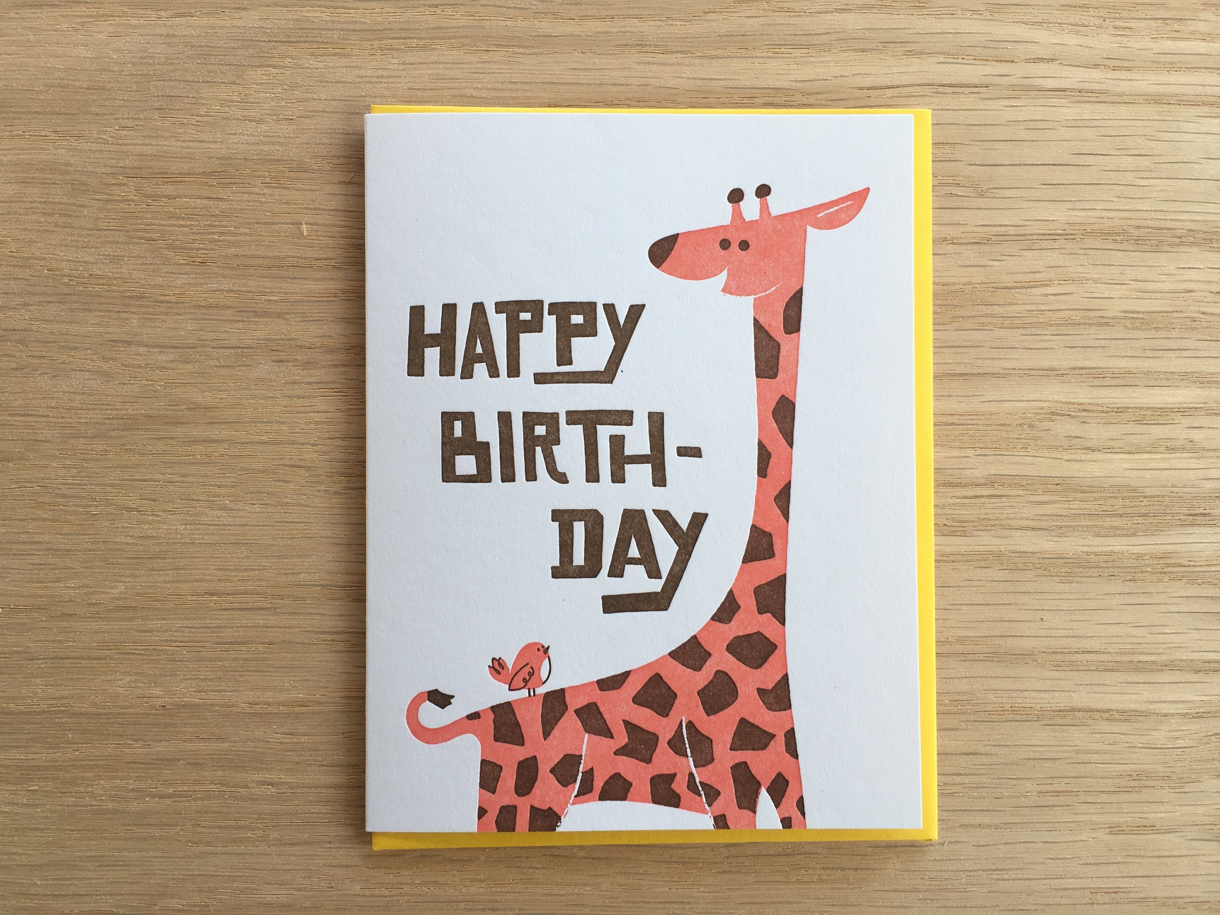
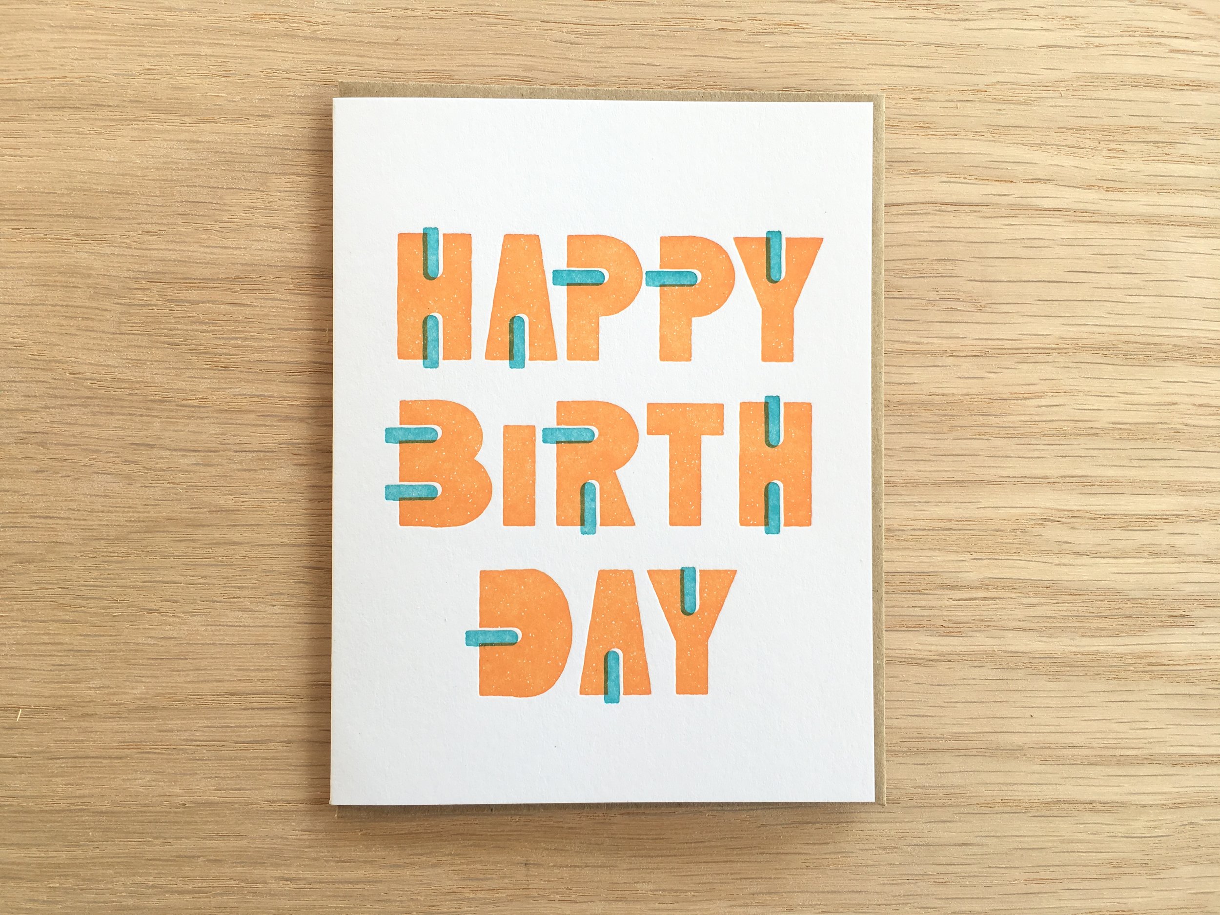
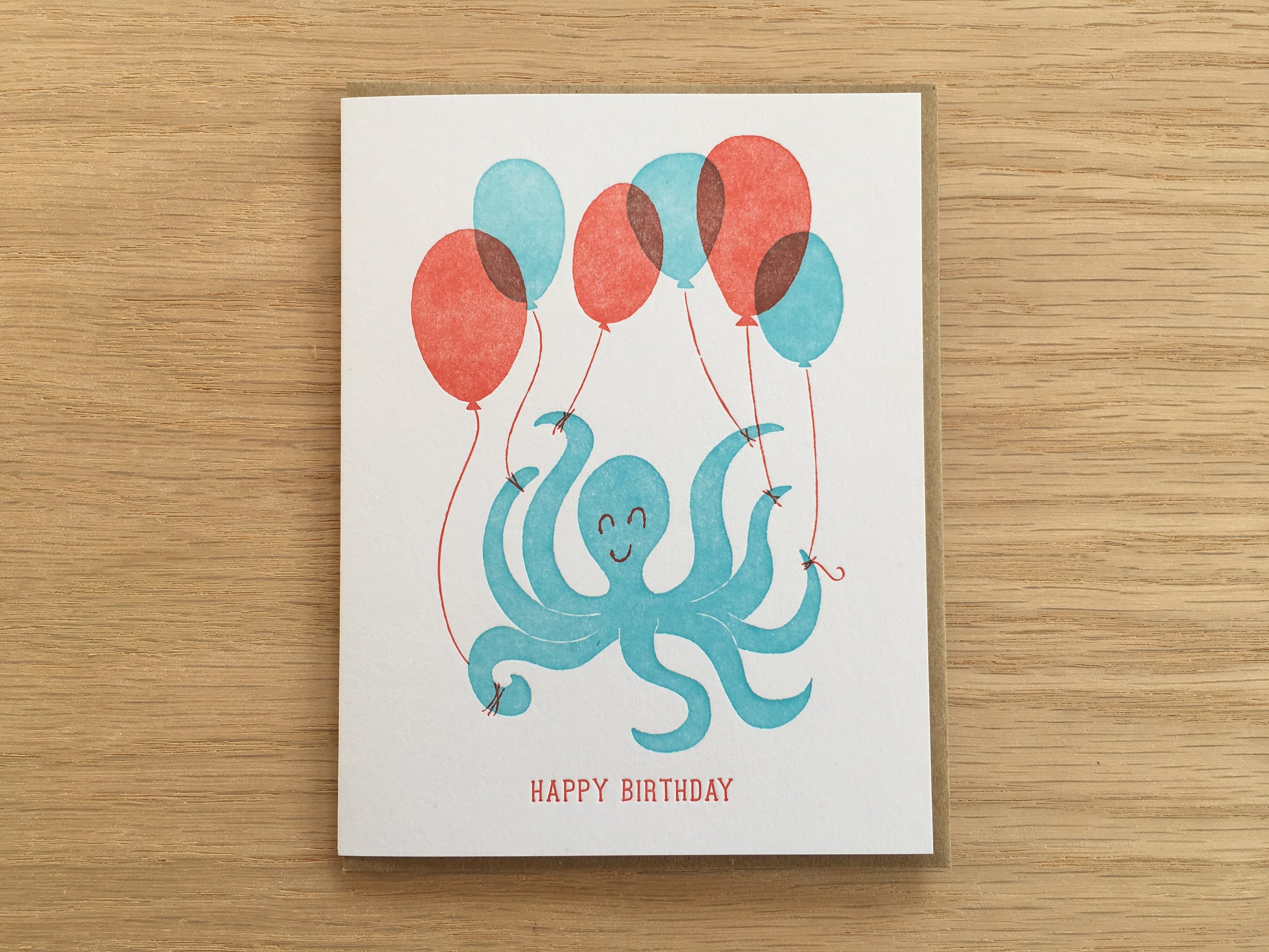
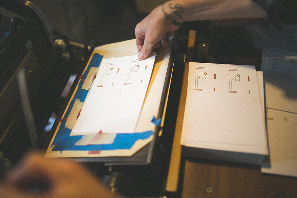
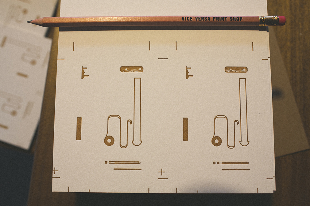
We're excited to release four new greeting cards today! These birthday cards are the first four designs from our brand new 2017 line that we've been working on for a number of months. We'll be rolling out new products from the line in sets of 4 and 5, so keep a lookout for the new arrivals in the coming weeks and months. And don't forget to pick up a  few of the new designs in the shop while your here!

Baby Shower Invites

Our shop is growing! We'll be welcoming our first little one this February. We couldn't be more thrilled! Part of the preparation and fun is getting to design and print our own shower invites and we sure had a blast doing it.

We've decided to wait to find out our baby's gender and we'll also be having separate gatherings for family and friends. For a gender-neutral invite, we went with orange and gray and decided on a two-sided duplex design to accommodate info for multiple showers with two different backs.

I've been really liking how French Paper performs on the press and have been looking for an excuse to use Orange Fizz. This was the perfect project to use French Paper's Sweet Tooth for the front and Orange Fizz for the back. Mixing custom ink colors in-house, we matched the orange ink to perfectly match the paper. After printing the front and two versions of the back, we duplexed the two 100# paper stocks and cut them to sized. The resulting 200# invite card makes for a very sturdy piece. With a bamboo accent printed on the French envelope flap, these guys are ready to ship!

Friday Highs: 003

Highlights from the interwebs these past few weeks:

Can't get enough of Dangerdom's MCM Illustration board on Pinteres.

Get Outside: Park Butte

I took a break from the shop this weekend and did an overnight hike to Park Butte lookout in the Mt. Baker National Forest. It was truly one of the best hikes I've been on. It feels like you should have to hike for 3 days to get the views at Park Butte, but it only took about 3 hours.

Here's a Hyperlapse video of where our party camped... some in the lookout cabin, some in the tents just below. 

A Case for Books

Just in case (see what I did there?) you were thinking of going into the furniture making business, here's a beautiful nudge... 

This is the fully animated story of making four bookcases. The four cases are made from two pieces of walnut veneer plywood with almost no waste. The base for the cases is made from solid walnut with mitered corners The bookcases are 33 inches tall and 47 inches wide.

Friday Highs: 002

For your inspiration consideration, here are the high points of my internet travels this past few weeks:

  • Pascal Campion is an amazing illustrator. This guy's been publishing a “sketch” a day, Monday-Friday. Since 2006. Yeah. His ability to capture light, movement and story is pretty fantastic. Here’s a great write up  and video about him on The Fox Is Black.
Screenshot 2014-07-03 10.05.39.png

Birthday Music

I had my 30th birthday five years ago today. To celebrate, I wrote, recorded and posted one song a day for thirty days and called it 30 Days and 30 Nights at Sea... A choose-your-own-musical-adventure telling the story of the final voyage of the Armageddon and her crew. It featured over two hours of new music with 9 collaborations with local musicians. I kicked it off on my birthday with chapter 1: Bon Voyage.

Man, time flies!

Summer Woodworking

What better way to kick off summer than to spend the entire day outside working with wood? I had a lot of different shop projects piling up over the past few busy weeks of printing, and finally had a chance to tackle them.

Photo Jun 21, 9 54 14 AM.jpg
Photo Jun 21, 10 33 21 AM.jpg

First up, a roller rack for holding ink rollers while die cutting or printing with only two rollers.

Next up,  a lower feed table shelf for holding tools and extra stuff while printing. 

Bonus: I'm always looking for my masking tape during makeready, so I made a horizontal tape dispenser for my "indispensable" blue tape. Now it's always at my fingertips. Magical!


The Shop is Growing

We're always working to improve things at the shop and bring as many services in-house as possible. So when we spotted this 1947 C&P Craftsman in Portland, we couldn't pass it up.

1947 Chandler & Price 10x15 Craftsman weighing in at 2,600 pounds.

1947 Chandler & Price 10x15 Craftsman weighing in at 2,600 pounds.

This green beauty is basically a newer, larger version of our old style 8x12 press with many advancements in design, improving maintenance, serviceability and output. This press was last used to die cut balsa wood airplanes. The former owner purchased all the dies from the failing company who used to mass produce them for toy stores. Rad!

Man, this press weighs a lot, but with a come-along winch, two pipes and a Johnson bar, it only took three of us to move it safely into the back corner of the print shop. Someone in years past took the liberty to paint it a minty green leaving the out of reach parts the factory gun-metal-gray. 

Photo May 27, 8 00 12 AM.jpg
Photo May 27, 8 00 28 AM.jpg

After thoroughly oiling the press and installing the single speed motor, we threw ink on the press and started tuning things up. If you didn't know, Craftsman presses have two hand dials that quickly and easily adjust the platen for alignment and pressure. The rails are also adjustable and replaceable if need be as opposed to the old style rails that have no adjustment. There are many layers of tape on our old 8x12 to to achieve good printing and the process for getting that tape job right is probably one of my least favorite aspects of printing with letterpress. Compared to taping, adjusting the rails on the Craftsman is worth the the upgrade. 

With a few fine adjustments and the installation of the variable speed motor, this beautiful beast will be ready to print in a matter of days. Just in time for the new project you've been think of!

Friday Highs: 001

For your inspiration consideration, here are the high points of my internet travels this past week:

Illustrator of the week: Jared Chapman. Mid-Century-Modern influences? Yes and yes.

Illustrator of the week: Jared Chapman. Mid-Century-Modern influences? Yes and yes.

— Look, an info graphic with real info. Important info at that. We Can Do Better 

— The HTML5 header execution mind-bottling. Visage - Beautiful, Branded Reports 

— These guys have mastered the brush tool! Gentlemen of Letters - A Dublin Sign Painting Film on Vimeo 

— A new slab serif with some tasteful details and two free weights to try. Sanchez Slab (via Subtraction)

— Sister-Shop Crush of the week (you know, another print shop we wouldn't mind being pen-pals with): Spofford Press. Eric Hoffman is a talented printmaker.  Looking at his etchings, you can tell he loves what he does. AND has has an awesome brussels griffon. He and Eleanor would be pals.

Gentlemen of Letters

Dublin has a rich history of hand painted signs decorating the city. Although it is not as common today, the craft still continues. To view work by the sign writers and artists featured in the documentary visit the links below: Kevin Freeney - http://www.flickr.com/photos/gentlemanofletters Colm O' Connor - http://www.colmoconnorsignwriter.com Maser - http://maserart.com/ James Earley - http://www.inputout.com/ Kevin Freeney Jr - http://www.kevinfreeney.com Also check out Toejam on facebook: Toejam: www.facebook.com/toejam000

Here's a fantastic 16 minute documentary on a multi-generational tradition of hand painted signs in Dublin, Ireland. Rad.

Via. Subtraction.

Tools: Line Guide

It's easy to lose perspective of element size when designing in Illustrator. Minimum line weights are extremely important to keep in mind: stray lines should be at least .35pt for deep relief plates, and .25pt for standard plates. Anything smaller, and lines may get wavy or fall out altogether. 

There can be a disconnect between the digital representation and the physical result, so we printed a few line guides. This handy reference, ranging from .35pt-2pts, was printed with a fairly good impression on French Paper, Whip Cream 140c (we also did some on Lettra 110#).

Printing a project with us? We'll drop one of these in with any paper samples we may send your way. No more fingers crossed. 

Original Pantone

We custom mix all of our inks using the Pantone Formula Guide. It's a fun process that allows us to match almost any color you have in mind for your project. So you can imagine what kind of eye-candy  this hand-made, 800 page extensive study on every color imaginable is. It predates Pantone by 271 years. Impressive!